Tracer interface
Picterra Tracer features an intuitive interface designed to streamline plot analysis, ensure data quality, and enhance data visualization for seamless decision-making.
Plot groups UI
Upon logging into Picterra Tracer, you’ll land on the Plot Group List page designed for uploading, organization and management of your plot data.
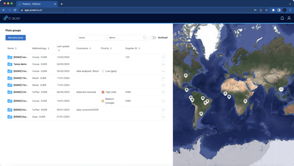
This intuitive interface allows you to quickly visualize key parameters related to your plot groups database, including:
- Name – Name of the plot group
- Methodology – analysis methodology and the type of commodity it has been applied to
- Created – Date of plot group creation
- Further custom information – customizable based on your needs and requirements for example Supplier ID, Comments.
On the right-hand side, an interactive map provides a geographical visualization of all plot groups listed on the current page. As you navigate through pages using the page controls in the bottom left corner, the map dynamically updates to display the locations of the plot groups on each page.
Plot view UI
After importing your plots, you can visualize and explore them in the Plot View.
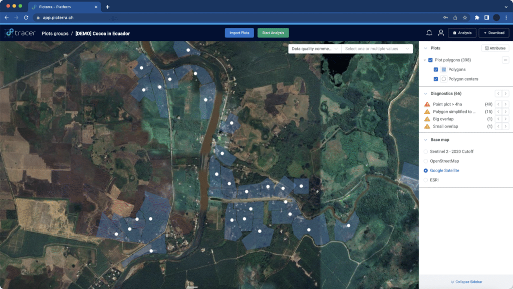
It features an interactive map combined with a sidebar, allowing you to preview:
- Plots – Mapping boundaries for each plot along with the polygon centers
- Diagnostics – Highlighting warnings generated from our data cleaning process related to the imported data
- Base maps – underlying map layers providing geographic context for your data
From this interface, you can:
- Import plots – Add additional data seamlessly.
- Edit plots – improve plot data
- Analyze plots – Run assessments on specific plots.
- View analysis results – Access insights generated for the plot group.
- Download plot data – Export files in Excel or GeoJSON format for further use.
Analysis UI
After running an analysis, you can view and explore the results in the Analysis View.
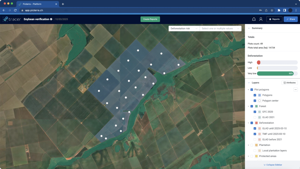
It features an interactive map combined with a sidebar, allowing you to preview:
- Analysis Summary – highlighting key insights depending on the type of analysis conducted.
- Layers – displaying plot polygons and centers, the specific analysis layers based on the selected methodology, and base maps that provide geographic context for the data.
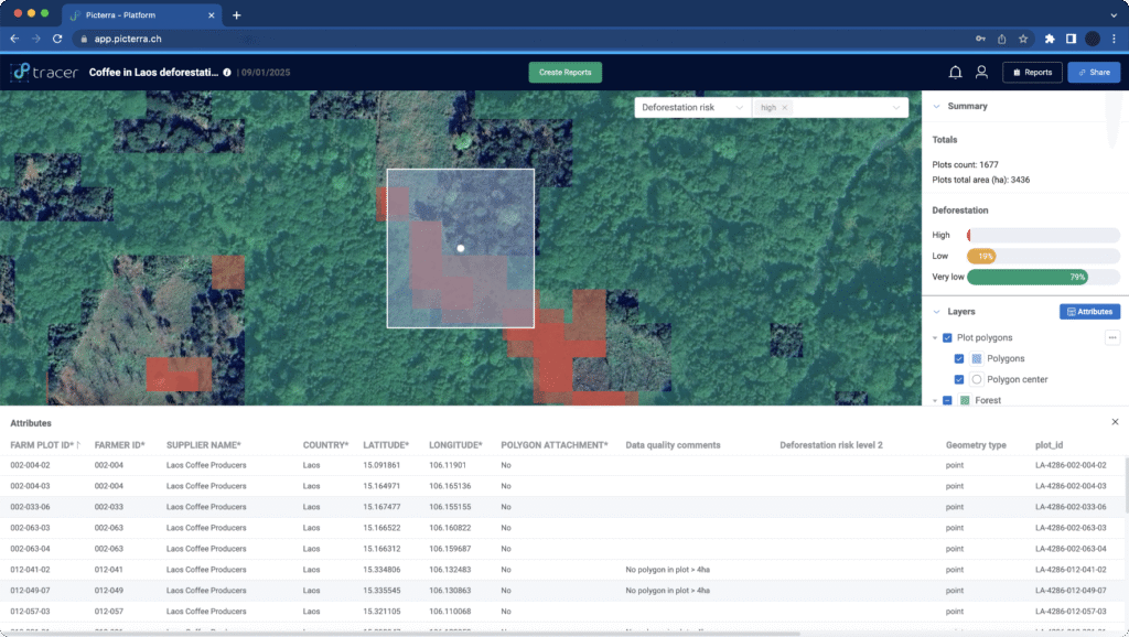
From this interface, you can:
- Generate Reports – Create detailed reports based on the analysis.
- Download Reports – Export reports in Excel, GeoJSON, and EUDR Traces NT format.
- Share Analysis Links – Easily share results with configurable permission settings.